Showing posts with label digital illustration. Show all posts

Sunday, July 7, 2013

On Character Sketches and Perseverance by Fred Koehler

This whole weekend I was supposed to be writing, but all I could bring myself to do was draw. Oh well. Wherever the muses descend, right? I had a pirate story that needed some characters, and apparently I was hungry, so I drew this:
Unfortunately, it just didn’t work for the story, which was frustrating because I liked the characters. I ended up with my concept sketch looking something like this:

It didn't work at all the way I had hoped, and I’m thinking this is the point where most people give up. Or start from scratch. I saw it as a fun opportunity to stretch myself as an illustrator and see how I could take the intentions behind the illustration and make it work for the story. I redrew select parts of the characters, and ended up with these three sets of characters, and the last one worked perfectly for my story! (Yay!)

Wednesday, July 4, 2012

Morning Flight process, Richard Jesse Watson and digital vs physical media - by Debbie Ridpath Ohi


To you Americans out there: Happy July 4th! Today I'm going to show you how I created one of my Daily Doodles (some of which I post on DebbieOhi.com). As I've mentioned before, I try to draw purely for the fun of it every day.


Sometimes I start with a blank digital canvas and just start drawing the first thing that comes into my head. Other times I'll do an image search for a word or phrase for inspiration. In this particular instance, I looked for "kite child" Google Image search and settled on the image at the top of a Flow Psychology page.


Ever since attending Richard Jesse Watson's session at the SCBWI Illustrators' Intensive Day in LA last year, I've been experimenting more with textures. I loved all the sessions that day and learned something new from each of them, but it was Richard's that affected me the most because his method (very loose and free) was closest to mine.

Richard Jesse Watson during an Illustrator Intensive
at the SCBWI-LA conference last year.

 Richard incorporated textures by manipulating and using a variety of physical media. I was fascinated and inspired, and was inspired to try something similar.

Richard Jesse Watson during an Illustrator Intensive
at the SCBWI-LA conference last year.
Since I work digitally, I had to look for other ways to bring texture into my drawings. I started experimenting with Photoshop's texture brushes.


To Photoshop users: you can find many, many texture brushes online as well as tips on how to install brushes, if you don't already know. You can also create your own brushes.


I used texture brushes and shades of yellow/orange to create a sunrise (or sunset, depending on how you choose to look at it). I used several layers so I could play around a bit with different colours.

When I was happy with the look, I added a plain black ground:


And grass:


And a silhouette of a running child. I had the child's arms stretching up to hold the kite:


Finally, I added the kite. I made the layer slightly transparent so you could see part of the sky showing through. I also added a paler colour to make it look like the sun was just peeking over the hill:


I put the sun on a different layer so I could move it around and see what worked best.

And yes, I'm all about layers. I know there's a much different satisfaction in working with physical media and I totally get why many artists prefer non-digital art, but the flexibility of digital media encourages me to experiment. 

With such a small office space and limited time, I'm not sure I'd feel as free to experiment with such a wide range of styles and methods if I knew that I'd have to re-do the entire piece if I screwed up, or potentially waste expensive art materials.

BUT before you traditional artists jump on me, I also admit that I don't have much experience in working with physical media. I'd love to hear thoughts from those who work regularly with both physical and digital art! Feel free to post in the comments section below.

Next up: the splendiferous Fred Koehler, whose Dad's Bad Day comes out from Dial Books For Young Readers in Spring 2014.

And just over two months until I'm Bored (new picture book written by Michael Ian Black and illustrated by yours truly) comes out, woohoo! Simon & Schuster Books For Young Readers have moved the publication date up to September 4th, 2012. CAN'T WAIT.

-- Debbie

I blog about writing & illustrating picture books for Simon & Schuster Books For Young Readers as well as writing & illustrating for young people in general. 


Wednesday, January 18, 2012

Concept is King and the rest of us are Jokers by Fred Koehler

For this week's post I thought I'd use a recent piece that was entered in the SCBWI Tomie DePaola contest based on the classic tale of Chicken Licken. (The sky is falling! The sky is falling!) You can see everybody's entries here.
My entry did receive a good number of comments, and a lot of them talked about an appreciation of the "concept" or "idea." So I thought I'd try and share a little bit as to where and how I find concepts and ideas for illustrations.

To be honest it all starts in a text document before I even pick up a pencil. I ask myself the question "What would make this funny? Or different? Or cool?" That list of answers might hit 30 or 40 before I'm start to go back through and decide which one(s) to research further. A lot of times I try to take what's expected and do the exact opposite. (Instead of "eating pancakes for breakfast," try "pancakes eating their breakfast.")

For the Chicken Licken story, my list included "looking through a hole in the sky" and "24 [the tv show] cut-scenes." Those two stood out and I sketched them, but wasn't thrilled with the results. But here's the cool part. In doing the sketches and researching the characters, I kept my eyes open for other concepts to add to the list. I talked through the sketches with friends and colleagues and my list of concepts grew even bigger.


During this process, lo and behold I encountered a vision of the holy grail of comic iconography – a rubber chicken. And where do rubber chickens live? In a toy box. From there I started wondering if there was an iconic toy counterpart to all of the other characters. Lo and behold there was! As I finished my research I never even ended up using the rubber chicken, but that's where it all started.

Then, after all that, I did sketches. I decided on a vintage palette and a toy shelf instead of a toy box (so it would be easier for the "sky" to be falling). The result, I thought, was successful.

I titled this blog "Concept is King" because I honestly believe that the work we do before ever setting pencil to paper is the most important. The magic of our character interactions, the reaction we hope to get from our viewer – we can document those intentions and work till we achieve them.

Best of luck to all of ya, and keep up the good work!

~Fred
flikr.com/superfredd

Wednesday, November 30, 2011

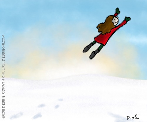
Snow Flight: created with the Sketchbook Pro app on the iPad by Debbie Ridpath Ohi

FinalSnowFlight v2 600

Can't believe how quickly this year went by! This was my first year with Pixel Shavings, and I want to thank Hazel, Russ, Sheri, Fred and John for all their encouragement. I feel honoured to be part of this amazingly talented group.

This week, I'm going to show you how I created my winter-themed illustration, SNOW FLIGHT, using Autodesk's Sketchbook Pro app for the iPad. First I created the sky in a separate layer using a flat blue. Then I added texture in a slightly darker blue.
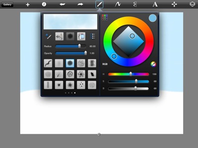
OHI03

One of the advantages of working digitally is that it's easy to make copies, in case I screw up. Before making a radical change to any layer, I always make a copy of that layer and then hide it, just in case I need it later. In the image below, you can see how I've hidden the extra layer by clicking on the eye icon. In the active/topmost layer, I then activated the transparency mask and then added a sunrise texture/color. Because of the mask, I'm only painting on blue part of the picture, not the snow.
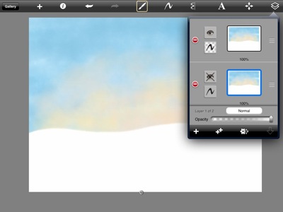
OHI05

In a new layer, I created a separate transparency mask for the snow. At first I tried doing this with white but found it too confusing so switched to an obnoxiously bright blue:
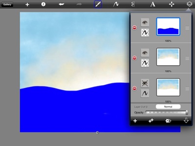
OHI07

After activating the transparency mask for the ground and painting it white, I added some texture to the snow. Then in another layer (I LOVE LAYERS), I did a quickie sketch of the flying girl.
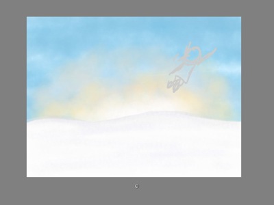
OHI12

Next, I drew the girl. Um…as you can tell, I pretty much ignored my original sketch. :-) After I finished the ink drawing, I deleted the sketch layer.
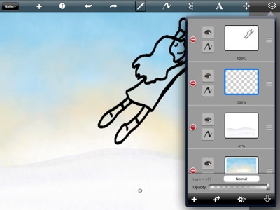
OHI14

Next, I added color. I should note that I always hated coloring when I was in school because I found it so boring; I was always the kid in school who drew stuff so other kids could colour. Now I love it! Coloring's much easier digitally because I can make the brush really big so it doesn't take as long. Then I can add textures.
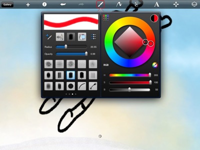
OHI15

Here's what the colored version looked like:
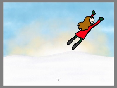
OHI16

I didn't like the way the black outline looked -- too boring and flat compared to the background -- so decided to add my woodcut effect, This is gradually becoming one of my "go-to" illustration styles because it feels so natural to me.

In Photoshop CS5, I use the Layer Mask tool but in this app, I used the Eraser tool instead:
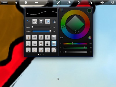
OHI19

I started manually erasing bits from the ink outline. This is the most time-consuming part of the process:
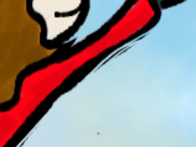
OHI20

But I think the results are well worth it (you can see a bigger version here):
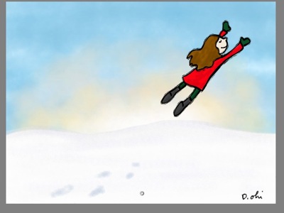
OHI25

I added some footprints in the snow and signed it, then took the image into Photoshop (the app lets you save in PSD format, yay) and added more shadows as well as adding the copyright notice. I could have done this on my iPad using Sketchbook Pro & other apps, but I was already in Photoshop.
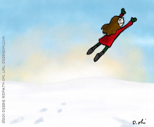
FinalSnowFlight v2 600

In case you were curious, I used a Pengo Stylus to draw on my iPad. It was a gift from my hubby -- he knows I find art supplies & tech hardware much more romantic than flowers and jewelry. :-)


Next up: a post from the fantabulous Fred Koehler!

- Debbie

DebbieOhi.com
On Twitter: @inkyelbows and @iPadGirl
Illustrator of I'M BORED, a new picture book by Michael Ian Black (Simon & Schuster Books For Young Readers, Fall/2012)

Wednesday, November 23, 2011

That Special Gift by Russ Cox

© 2011 Russ Cox | Smiling Otis Studio

As the holidays quickly approach and we begin to reflect on this past year, I just wanted to take a moment to say "THANK YOU" to Hazel, Sheri, Debbie, Fred, and John for letting me be part of this spectacular group of artist/writers. They say you cannot teach an old dog a new trick but with the feedback, support and encouragement from my fellow Pixel Shavers, I say you can. Each one has been a major influence on the direction my artwork is heading and on me as a person. I cannot thank you enough. They are also responsible for giving me a swift kick in the rump I needed to start writing. I would never have even considered taking that journey without that push down the writing path. So this illustration I am posting today, is for each of them and to all of my family and friends. You truly are "that special gift" in my life.

Also a big THANK YOU for coming to the Pixel Shavings glog and following our journey this year. Have a wonderful holiday season and cheers to 2012!

Russ

The charismatic Debbie Ohi will be up to bat next week.

www.smilingotis.com
Smiling Otis Facebook Fan Page
Smiling Otis Studio Blog

Wednesday, August 31, 2011

Joe Bob Gristleneck the Banjo Playing Pig by Russ Cox


© Russ Cox | Smiling Otis Studio

For my post this week, I am continuing my adventure in painting with Photoshop. I am trying to capture my traditional style of using gouache and color pencil while maintaining bright, lively colors. Some of you may be saying "why not just paint it traditionally". Working digitally allows me to experiment more with colors and adjust the layout if I need to do so without redrawing it each time. I think each time you have to redraw a sketch, it tends to loose it freshness. Even though I do color and tonal roughs for balance and light placement, I still like playing with colors as I work. With this piece I really wanted a fun balance of complimentary colors to add life to the final illustration. By building the colors up in layers, allowed me to keep things bright. Working this way also allowed me to get a colored pencil looking texture in areas, especially the pig. I also wanted the original sketch to show through as much as possible. My goal is to do a new piece every two weeks and take what I learn from the previous illustration, to build upon the next one. Hopefully my portfolio will have a new look to it as well for the New York SCBWI conference in January. This experimenting really transfers over well to working traditionally. As artist we must continue to learn new things and improve on what we know.

Check in next week for what the wild and wonderful Debbie Ohi has in store for you. I am sure it will be a treat and learning experience for all.

www.smilingotis.com
Smiling Otis Facebook Fan Page
Smiling Otis Studio Blog

Wednesday, July 6, 2011

Photoshop method by Fred Koehler

It's a hot summer in Florida, and I thought I'd give you a glimpse of a Photoshop method I used with this sketch of my daughter at the swimming pool.

 Choose a base color for the background and sketch on a new layer.

Under the sketch layer, add dark and light values.

Create a new layer with the blend mode "color" and bring in some selective dominant color.

Add some interesting background detail and you're all done!

See more at freddiek.com and check back next week to hear from the magnificent Sheralyn Barnes.