Showing posts with label ipad. Show all posts

Wednesday, April 11, 2012

From Chicken Scratch to Final by Russ Cox

All images © 2012 Russ Cox | Smiling Otis Studio

Hello everyone! For my post I thought I would share how I developed the idea for a poster contest. Sometimes an idea gets stuck in your head and you need to pursue all avenues to see if it is a good one. This illustration was created for the NESCBWI Conference poster contest. The theme for this year's poster is "A Whole New World". The idea that hit me right away was to use Mother Goose, since she is a standard symbol for children's books and stories, using an iPad which is being used more and more by children to read and interact with stories. 

Originally I wanted to use other iconic characters from children's books. The first sketch shows Mother Goose with Max (Where The Wild Things Are), Pinocchio, and The Three Little Pigs. I liked the idea of them being crowded around the iPad but the overall composition was too busy.


The next idea was a straight on view. I felt it is too direct and lacked a warmth that was needed to tie the "old" and "new" together. You can see the little doodles on the outside of the sketch as I played with composition. At one point, the iPad was very large with the characters staring at it. That composition had too much of a "Big Brother" feel to it.


I went back to Mother Goose as the focal point and had the characters sitting around her and the iPad as if she was reading to them. This was getting better but it lacked the interaction I felt was needed and it needed everyone viewing the device.

Another idea for this concept was if I made Mother Goose a human, riding on a goose with the iPad. Compositionally it was good but then it looked like more of her using a GPS than reading on the device. In the bottom corner, I did a little doodle where she was back to being a goose and facing left. Having her facing left was like she was not ready to move forward but secretly loved the iPad. I moved forward with this idea.

I did a tighter sketch of the idea but added Hickory Dickory, along with the mouse,  to symbolize time and Humpty Dumpty to represent the fragility of embracing digital stories while being true to books and being scared of the new technology.


The above sketches where drawn separately so I could move things around in Photoshop to get the scale and placement to my liking. Instead of clouds in the background that where in the original sketch, I decided to have a book case in the background. This warmed up the tone of the illustration and help strengthen the concept.


Here is the final illustration. I was quite happy with the final and hopes it captures the theme.

Be sure to check back in two weeks for the marvelous Debbie Ohi!

You can view more of my work at:

Wednesday, November 30, 2011

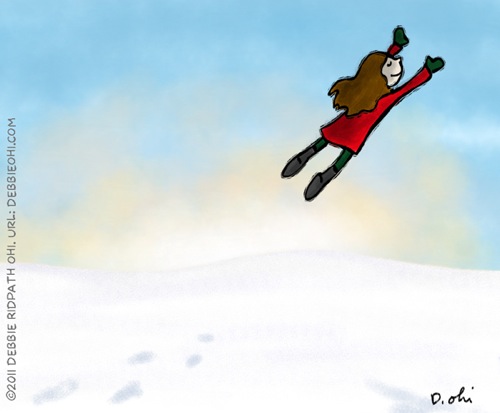
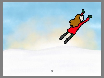
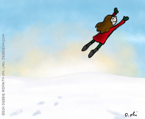
Snow Flight: created with the Sketchbook Pro app on the iPad by Debbie Ridpath Ohi

FinalSnowFlight v2 600

Can't believe how quickly this year went by! This was my first year with Pixel Shavings, and I want to thank Hazel, Russ, Sheri, Fred and John for all their encouragement. I feel honoured to be part of this amazingly talented group.

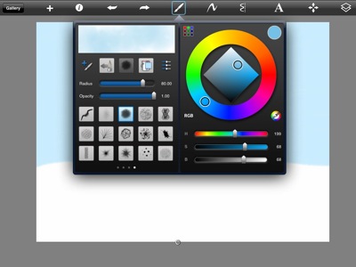
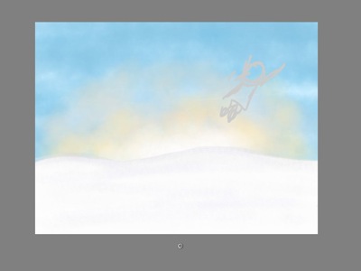
This week, I'm going to show you how I created my winter-themed illustration, SNOW FLIGHT, using Autodesk's Sketchbook Pro app for the iPad. First I created the sky in a separate layer using a flat blue. Then I added texture in a slightly darker blue.

OHI03

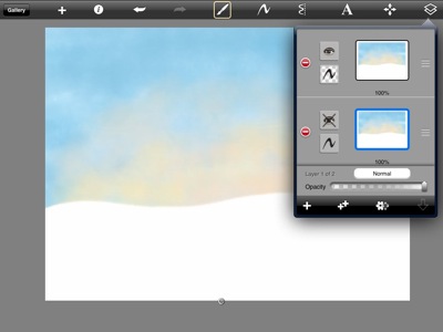
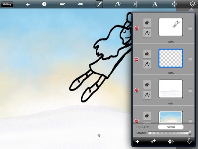
One of the advantages of working digitally is that it's easy to make copies, in case I screw up. Before making a radical change to any layer, I always make a copy of that layer and then hide it, just in case I need it later. In the image below, you can see how I've hidden the extra layer by clicking on the eye icon. In the active/topmost layer, I then activated the transparency mask and then added a sunrise texture/color. Because of the mask, I'm only painting on blue part of the picture, not the snow.

OHI05

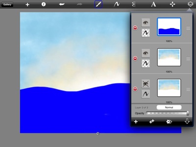
In a new layer, I created a separate transparency mask for the snow. At first I tried doing this with white but found it too confusing so switched to an obnoxiously bright blue:

OHI07

After activating the transparency mask for the ground and painting it white, I added some texture to the snow. Then in another layer (I LOVE LAYERS), I did a quickie sketch of the flying girl.

OHI12

Next, I drew the girl. Um…as you can tell, I pretty much ignored my original sketch. :-) After I finished the ink drawing, I deleted the sketch layer.

OHI14

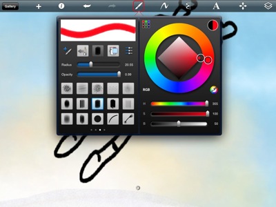
Next, I added color. I should note that I always hated coloring when I was in school because I found it so boring; I was always the kid in school who drew stuff so other kids could colour. Now I love it! Coloring's much easier digitally because I can make the brush really big so it doesn't take as long. Then I can add textures.

OHI15

Here's what the colored version looked like:

OHI16

I didn't like the way the black outline looked -- too boring and flat compared to the background -- so decided to add my woodcut effect, This is gradually becoming one of my "go-to" illustration styles because it feels so natural to me.

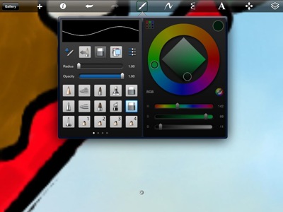
In Photoshop CS5, I use the Layer Mask tool but in this app, I used the Eraser tool instead:

OHI19

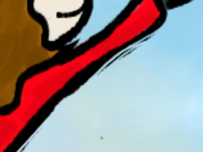
I started manually erasing bits from the ink outline. This is the most time-consuming part of the process:

OHI20

But I think the results are well worth it (you can see a bigger version here):

OHI25

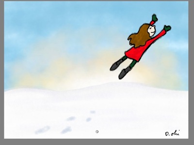
I added some footprints in the snow and signed it, then took the image into Photoshop (the app lets you save in PSD format, yay) and added more shadows as well as adding the copyright notice. I could have done this on my iPad using Sketchbook Pro & other apps, but I was already in Photoshop.

FinalSnowFlight v2 600

In case you were curious, I used a Pengo Stylus to draw on my iPad. It was a gift from my hubby -- he knows I find art supplies & tech hardware much more romantic than flowers and jewelry. :-)


Next up: a post from the fantabulous Fred Koehler!

- Debbie

DebbieOhi.com
On Twitter: @inkyelbows and @iPadGirl
Illustrator of I'M BORED, a new picture book by Michael Ian Black (Simon & Schuster Books For Young Readers, Fall/2012)

Wednesday, June 29, 2011

Sketching on the iPad Using Procreate App - by Debbie

I had heard good things about Savage Interactive's Procreate app for the iPad, so decided to check it out. Nice user interface, and I'm intrigued by the brush-tweaking capabilities. I found the app's preloaded brush set pretty limited, so will be definitely experimenting more with brush import features.

 
If you're just interested in my summary of the app, skip down to the end of this post.
The image above is my first attempt using Procreate on the iPad. Here's how I did it:


First, I created a new layer and used the Fill command (option when you select a Layer) to choose a basic blue background. Then I browse the Brushes and experimented with textures to use in the sky, on top of the blue.


I used several colors of a stipple pattern for the sky, and then used green for a hillside, and played around with adding textures to that as well.


I created a separate layer and did an ink outline of a little girl. I wasn't crazy about the brush selection for straight inking; I'm going to experiment later with making a brush that has more variety in thickness. For now, though, I chose a basic flat brush.


At this point I realized that the initial colors I chose were way too dark, but decided to fix them later on. I added the ghost figure here, some misty bits, then played around with transparency of the misty layers so the lines wouldn't be so harsh.

I also added a shadow, fiddled around some more with the background to soften up the stipple effect. Then I took the Eraser and worked on the ink outline of the girl to make the outline a little more irregular as well as experimenting with the Smudge tool. Again, I'm hoping to eventually create or find a Brush that's a little closer to the Drippy pen I like so much in Corel Painter.

I could have lightened up the whole thing via an iPad app like Photogene but I decided to use Photoshop instead. Here's the final result:


And so ends my first attempt at using the Procreate App for the iPad. I'm intrigued enough by the interface that I'm going to do some more experimenting with this app. Things I like include:

- eye dropper shortcut tool
- option to insert a photo (handy for photo ref?)
- option to remember tool size & opacity
- supposedly you can export in layered PSD format (haven't tried this yet, though)


Features I need to try out:

- saving colour swatches/sets
- layer blend modes (multiply, screen, add, lighten, exclusion)
- playing around with brush characteristics
- locking alpha pixels (so that transparent pixels aren't affected by paint)
- using Transform to move individual layers around as well as scaling & rotating

Related links:


Come back next week for a post from the fabulous Fred Koehler!

-- Debbie Ridpath Ohi 
On Twitter: @iPadGirl (digital, ebooks, iPads) & @inkyelbows (writing)


Wednesday, March 16, 2011

Japan Earthquake Survivor: iPad Sketch Process - by Debbie Ridpath Ohi

I do a lot of sketching on my iPad (no, I don't have an iPad 2 yet) and I thought I'd share the process for those interested.


As I've mentioned before, I do daily sketches; it's the equivalent of my morning cup of coffee in terms of drawing creativity. Today's sketch was inspired by the recent tragic events in Japan. My family has many relatives and friends in Japan, including Sendai, and we've been worried about them all.

Just found out yesterday morning that my friend and her young daughter in Sendai are fine, which is a huge relief. Their building is damaged and they have no water or gas, but they do have electricity. My heart goes out to those who are still waiting to find out if their loved ones are all right.


I created today's daily sketch on my iPad using Autodesk's Sketchbook Pro app and a PenGo stylus. I took some screenshots along the way. As you can tell from the screenshot above, I don't tend to do much sketching before my sketches. ;-)


On the iPad, however, I usually start with a basic shape outline to help me properly place my sketch, else I might end up running out of room -- and on the iPad, there isn't a drawing app yet that will allow me to add pixels.


I like the fact that you can create layers in the Sketchbook Pro app. I generally my sketches with the ink outline first, then add color in other layers.


I fiddle with the opacity of some layers:


And I use different brushes to add textures:


I can use the pinch/zoom gesture to work on individual bits of the drawing up close:


Because there are very limited number of layers permitted in Sketchbook pro, I also keep merging layers so I can create new ones:

If I wasn't constantly taking screen shots for this post, the sketch would probably have taken me about 15 minutes. I added the small figure on the right side of the sketch at the last minute because I found the drawing too static/boring. Adding the little figure immediately creates an underlying story, making the viewer ask more questions about what's going on.


I've always liked trying to build in some kind of story in every drawing, even if it's just one of my daily doodles.

The final sketch is above. If I was going to turn this into a "real" drawing, I'd lighten up the colors a ton (it's way too dark right now) and make the sky textures more varied, maybe add some moody clouds.

Anyway, I hope this inspires some of you iPad owners to do more drawing using your device!

-- Debbie Ridpath Ohi
(@iPadGirl and @inkyelbows on Twitter)