Wednesday, January 25, 2012

Tea Time by Sheralyn Barnes

It's January.
That time of year when the winter doldrums set in.
So this week, as the grey skies were bringing me down,
and I was feeling a bit small,
I thought to myself how nothing beats the winter blues like
a hot cup of tea,
a friend,
and my imagination.


 ©2012 Sheralyn Barnes


 And then I pulled out this old friend again,
who despite appearances,
should be getting us closer to spring here soon.....

 ©2012 Sheralyn Barnes

 Happy Groundhogs day on February 2nd!

Spring will be here before we know it....

Thanks for checking in!
You can see more of my work at 

Look for another great post by
John Deininger next week!

Wednesday, January 18, 2012

Concept is King and the rest of us are Jokers by Fred Koehler

For this week's post I thought I'd use a recent piece that was entered in the SCBWI Tomie DePaola contest based on the classic tale of Chicken Licken. (The sky is falling! The sky is falling!) You can see everybody's entries here.
My entry did receive a good number of comments, and a lot of them talked about an appreciation of the "concept" or "idea." So I thought I'd try and share a little bit as to where and how I find concepts and ideas for illustrations.

To be honest it all starts in a text document before I even pick up a pencil. I ask myself the question "What would make this funny? Or different? Or cool?" That list of answers might hit 30 or 40 before I'm start to go back through and decide which one(s) to research further. A lot of times I try to take what's expected and do the exact opposite. (Instead of "eating pancakes for breakfast," try "pancakes eating their breakfast.")

For the Chicken Licken story, my list included "looking through a hole in the sky" and "24 [the tv show] cut-scenes." Those two stood out and I sketched them, but wasn't thrilled with the results. But here's the cool part. In doing the sketches and researching the characters, I kept my eyes open for other concepts to add to the list. I talked through the sketches with friends and colleagues and my list of concepts grew even bigger.


During this process, lo and behold I encountered a vision of the holy grail of comic iconography – a rubber chicken. And where do rubber chickens live? In a toy box. From there I started wondering if there was an iconic toy counterpart to all of the other characters. Lo and behold there was! As I finished my research I never even ended up using the rubber chicken, but that's where it all started.

Then, after all that, I did sketches. I decided on a vintage palette and a toy shelf instead of a toy box (so it would be easier for the "sky" to be falling). The result, I thought, was successful.

I titled this blog "Concept is King" because I honestly believe that the work we do before ever setting pencil to paper is the most important. The magic of our character interactions, the reaction we hope to get from our viewer – we can document those intentions and work till we achieve them.

Best of luck to all of ya, and keep up the good work!

~Fred
flikr.com/superfredd

Wednesday, January 11, 2012

I'M BORED book illustration from sketch to final - by Debbie Ridpath Ohi


In this post, I'm going to show the step-by-step evolution of one of the images from I'M BORED, a new picture book from Michael Ian Black and illustrated by yours truly. You can see a bigger version of the spread above on the Simon & Schuster website graphic excerpt page from I'M BORED.

I love Michael's story. It's funny and inspiring, and I think it's going to appeal as much to grown-ups as it will to kids. I had a ton of fun creating the illustrations for this book and thought I'd share part of the process.


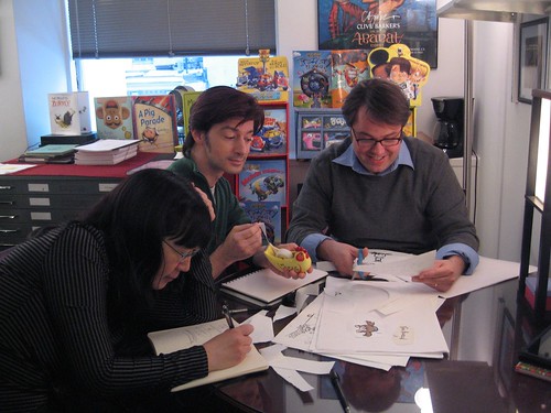
Above: an early version of the "little girl pretending to be a rampaging monster" image. I made the notes during a meeting with Justin Chanda (publisher & editor) and Laurent Linn (my art director).

With Laurent Linn & Justin Chanda at S&S.
Photo by Danielle Young.

They loved the monster hat on the girl. We decided to make the girl's mouth look more interesting; Justin & Laurent suggested making it look a bit more like the monster's, maybe echoing the shape. We also decided at this point to make any fantasy elements in the story easier to separate from the real-life elements by coloring them blue.


Above: the preliminary sketch for my revamped drawing. My sketches tend to be very loose, as you can tell, mainly to block in the shapes. Next, I added the line art:


Then I added the fantasy elements in the background (the town), color and the woodcut finish to the line art.


At my next meeting with Justin and Laurent, we decided to color in the girl's mouth throughout the book and to move the potato to the foreground where it would be more noticeable. Plus I needed to add the screaming people back into image (oops, I'd forgotten them). Here are my notes during the meeting:


And here's the revamped image:


In the final layout, Laurent flipped the image so it would work better with the overall spread, then added text:


I LOVE how it turned out and can't wait to see this book on the shelves.

I'll be talking more about the process of creating I'M BORED with Simon & Schuster Books For Young Readers in the I'M BORED Facebook Page, so please do bookmark/Like.

Next up on Pixel Shavings: the fabulous Fred Koehler!

For more info about my projects, please visit DebbieOhi.com. I blog about kidlit/YA writing and illustrating at Inkygirl.com.

Wednesday, January 4, 2012

Developing A Concept by Russ Cox

© 2012 Russ Cox | Smiling Otis Studio

Happy New Year Everyone! For my first post of 2012, I thought I would share how I developed the concept for the above illustration. 


I started out with doodling in my sketchbook. The idea of a child swinging on an old branch was too symbolize "old and new" as well friendship.


After working up the sketch into a tighter drawing, the symbolism was not working and the tree branch became too scary. Especially when the end of the branch was turned into a gnarled hand. It seemed to be ready to grab the girl instead of forming an arch to show protection.

Since the sketch was not working, I decided to go back to doodling, trying to rework the concept or come up with something complete different. Sometimes it is best to step back and come from another angle. The idea was to make the illustration warmer in concept, so I thought what if she had a large oafish friend who would do anything for her. Maybe something happened to the tree where she had the swing and her friend was welling to pretend to be one to make sure she was happy. 
After roughing in the new layout, I noticed that I did not like the position of the rope over the girl's face. Plus the hand turned down had a negative feeling so I thought he needed his hand turned upward. Since he is pretending to be a tree, it was natural to put a bird's nest in his open hand.


I sketched out the new hand and girl which I dropped over top of the existing sketch. It saved me time redrawing the sketch for a third time since I would be doing a tighter version as my base for the final color illustration. I feathered the edges in Photoshop when I cut out the images so they overlapped the original sketch seamlessly.
The flowers were removed because they were a distraction from the interaction between the two characters. This is the final sketch which became the base of the final illustration which I rendered in Photoshop.
 In the final illustration, I wanted to mute the color palette so the warmth of their friendship shined through.
Having worked in Photoshop for the past 8 months, I think I am ready to tackle Painter so I may post the results next time.


Thanks for reading and following our glog.
Russ

Look for Debbie Ohi's always inspiring and insightful post next week

www.smilingotis.com
Smiling Otis Facebook Fan Page
Smiling Otis Studio Blog