 RUSS COX - As 2013 comes to a close, now is a good time to look back and be thankful for what happened during the year.
• I am excited to be agented by Sadler-Cavarette Children’s Literary
• Major Manners Nite Nite Soldier, which I illustrated, won several awards including the Benjamin Franklin Award
• Major Manners Nite Nite Soldier, which I illustrated, won several awards including the Benjamin Franklin Award
• Freddy The Frogcaster, another book I did the illustrations for and written by Janice Dean, reached the top 25 in books sales on Amazon
• I just signed up for two more Freddy books
• Whatever Says Mark, a book I did with Capstone, was released
• I am illustrating a Christmas book written by Lynn Plourde that will be released in 2014
• In September I was selected to be a presenter for the NESCBWI’s spring 2014 conference
• My Mother Goose piece will be on permanent display at Boston Children’s Hospital
• My Mother Goose piece will be on permanent display at Boston Children’s Hospital

The biggest highlights of the year were more on a personal level. Our lovely daughter married her best friend and soul mate, Andrew Aho, in May. Lynn and I are so thrilled to have Andrew as a son-in-law. We look forward to see where the winds of life will take them.


DEBBIE OHI - I have much to be grateful for in 2013.
On the kidlit front, I did the illustrations for NAKED!, a new picture book written by Michael Ian Black, coming out from Simon & Schuster Books For Young Readers in May 2014. I was able to announce three new book contracts with Simon & Schuster: I'll be (1) illustrating SEA-MONKEY AND BOB by Aaron Reynolds, (2) writing and illustrating TWO more picture books.


 Had lots of fun at the SCBWI annual conferences. One of my highlights of the Summer conference: hanging out and chatting with Fred Koehler, plus getting a chance to see his HOW TO CHEER UP DAD f&gs (book comes out in March 2014).
And speaking of Pixel Shavings creativity, I so enjoyed Hazel's illustrations in ONE WORD PEARL this year! See Hazel's interview on Inkygirl about her process.
I was way nervous about my very first keynote speaker gig but ended up having so much fun at the SCBWI Canada East convention in Montreal, plus made some new friends.
The more good things that happen, the more grateful I am for those who have encouraged me in the past. Like my Pixel Shavings friends. :-)
Photo credit for Debbie-SCBWI-Montreal-UrveTamberg.jpg - Urve Tamberg.
FRED KOEHLER - Greetings from Fred in the land of Fixin' To Publish a Book. Woot woot!

My very first title, HOW TO CHEER UP DAD, debuts in March with editor Kate Harrison and Art Director Lily Malcom at Dial Books for Young Readers. I've been super-stoked to go through the publishing experience. You can check it out on Amazon here or buy it from your local bookseller in March 2014. Betsy Bird at the School Library Journal Blog got an early sneak peek at HOW TO CHEER UP DAD and had nice things to say about it. Oh yeah, and here's the final cover:
 I've gotten so many incredibly kind emails and questions about the process that I've put together a couple of pieces of general advice to share. The SCBWI published my success story, which I've posted to my blog at freddiek.com. I also posted an article for aspiring authors called You Wrote A Book. Yay! Now What? This piece is more for beginners just to help wrap their brains around the publishing process.
So what else is new? I'm writing and drawing almost every day. I'm kind of stuck on monsters right now, and I wanted to share this concept illustration for a new book idea I'm working on. I know I've got a lot to learn, but that's what makes being an artist so doggone exciting. I keep making new friends and am so thankful to have a chance to be successful in this incredible industry. Cheers.
 SHERALYN BARNES - Happy Thanksgiving!
It's been a year of lovely things to be thankful for... I spent a large part of the year working on a children’s book about our great national parks for the Sequoia Natural History Association. What a treat it was to take myself on a tour of the parks in my imagination. As a young adult, I worked in Yellowstone National Park for three summers and two winters, so it was an inspiring project for me. I’m happy that my artwork will help inspire kids to go out and experience our national treasures. The book will be released in March through Sequoia Natural History Association and the National Park outlets.


 The learning game flashcards that I designed for Gryphon Design Collective called “What We Wear” came out this year. I had fun drawing all kinds of fun animals for this project. It was a challenging project in that it highlighted clothes within a beach/sand/surf motif. Truly a challenge! (Pat on back)
This year also marks the year that I begin working with the (most excellent) agent, JoAnne Schuna. I am honored to be represented by such a wonderful person. www.schunagroup.com.


In May, I made a pilgrimage back to my home state of Indiana to attend the Wild, Wild, Midwest SCBWI Conference. What a great conference! Presenters included the great Peter Brown and the amazing Laurent Linn (art director for Simon and Schuster). I was very honored to be the first runner up in the juried art show with my Girl and Bear illustrations. It was a true milestone for me. It was four years ago this November that I was living in Louisville, KY and attended an SCBWI conference in Indianapolis where Laurent Linn was presenting. His amazing enthusiasm and stellar presentations reawakened my desire to pursue children’s illustration and led me to attend more national conferences. So it was even more of an honor that he was one of the judges for this art show. My heart seriously glowed realizing how far I’ve come, thanks to so many people who have inspired me along the way. The inspiration continues.

HAZEL MITCHELL - this year has flown by and I'm thankful for the opportunities that have come my way.
This year has been a busy one for books ... in Spring '1,2,3 by the Sea' from Kane Miller (by Dianne Moritz), in Fall 'One Word Pearl' from Charlesbridge (by Nicole Groeneweg) and 'Double Crossed at Cactus Flats' from Magic Wagon by Rich Wallace. Right now I'm working on a folktale for Charlesbridge called 'Imani's Moon' publication Fall 2014 (by JaNay Brown Wood). In between I've completed educational and independent projects. Whew! I am thankful for a sit down!
It's been a really great year for travel and for visiting with friends back in Europe and in the USA, and with so many great colleagues too! I was lucky enough to attend Bologna Children's Book Fair this year for the first time and to speak at conferences as far away as Paris and as near home as Massachusetts. I've visited book stores, spoken at schools and attended book festivals. I am thankful for the lovely people who have hosted and interviewed me on their blogs, and supported me in my career. And for all those people who have written to me on social media and through snail mail.
When you're in the midst of a lot of work and travel, with the highs also come the lows. Then it's helpful to reflect on what's been and what's to come. To think about what's important, and what's not. So I'm taking a little moment to look back and recall what I have to be truly thankful for this year ... friends - creativity - opportunity - my animals - the chance to continue story telling into 2014 and hopefully to find that I can finally add 'author' to my resume.
 Oh also, thanks to my hubby for all his support!
Here's to you and to yours and THANK YOU for stopping by Pixel Shavings and catching up with our news.
Photo credit for Debbie-SCBWI-Montreal-UrveTamberg.jpg - Urve Tamberg.
FRED KOEHLER - Greetings from Fred in the land of Fixin' To Publish a Book. Woot woot!

My very first title, HOW TO CHEER UP DAD, debuts in March with editor Kate Harrison and Art Director Lily Malcom at Dial Books for Young Readers. I've been super-stoked to go through the publishing experience. You can check it out on Amazon here or buy it from your local bookseller in March 2014. Betsy Bird at the School Library Journal Blog got an early sneak peek at HOW TO CHEER UP DAD and had nice things to say about it. Oh yeah, and here's the final cover:
 I've gotten so many incredibly kind emails and questions about the process that I've put together a couple of pieces of general advice to share. The SCBWI published my success story, which I've posted to my blog at freddiek.com. I also posted an article for aspiring authors called You Wrote A Book. Yay! Now What? This piece is more for beginners just to help wrap their brains around the publishing process.
So what else is new? I'm writing and drawing almost every day. I'm kind of stuck on monsters right now, and I wanted to share this concept illustration for a new book idea I'm working on. I know I've got a lot to learn, but that's what makes being an artist so doggone exciting. I keep making new friends and am so thankful to have a chance to be successful in this incredible industry. Cheers.

It's been a year of lovely things to be thankful for... I spent a large part of the year working on a children’s book about our great national parks for the Sequoia Natural History Association. What a treat it was to take myself on a tour of the parks in my imagination. As a young adult, I worked in Yellowstone National Park for three summers and two winters, so it was an inspiring project for me. I’m happy that my artwork will help inspire kids to go out and experience our national treasures. The book will be released in March through Sequoia Natural History Association and the National Park outlets.
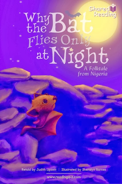

I had the pleasure of doing a couple more projects with Reading A to Z this year. “Silly Sarah”, which came out last year, had me drawing a lot of fun farm animals. This year, my imagination got to go to Africa with a retelling of a Nigerian folk tale “Why the Bat Flies Only at Night”. Currently I’m working on a project for 2014 that takes me on a Costa Rican rain forest adventure with a sloth. Just my speed! I love sloths!
 The learning game flashcards that I designed for Gryphon Design Collective called “What We Wear” came out this year. I had fun drawing all kinds of fun animals for this project. It was a challenging project in that it highlighted clothes within a beach/sand/surf motif. Truly a challenge! (Pat on back)
This year also marks the year that I begin working with the (most excellent) agent, JoAnne Schuna. I am honored to be represented by such a wonderful person. www.schunagroup.com.


In May, I made a pilgrimage back to my home state of Indiana to attend the Wild, Wild, Midwest SCBWI Conference. What a great conference! Presenters included the great Peter Brown and the amazing Laurent Linn (art director for Simon and Schuster). I was very honored to be the first runner up in the juried art show with my Girl and Bear illustrations. It was a true milestone for me. It was four years ago this November that I was living in Louisville, KY and attended an SCBWI conference in Indianapolis where Laurent Linn was presenting. His amazing enthusiasm and stellar presentations reawakened my desire to pursue children’s illustration and led me to attend more national conferences. So it was even more of an honor that he was one of the judges for this art show. My heart seriously glowed realizing how far I’ve come, thanks to so many people who have inspired me along the way. The inspiration continues.

HAZEL MITCHELL - this year has flown by and I'm thankful for the opportunities that have come my way.
This year has been a busy one for books ... in Spring '1,2,3 by the Sea' from Kane Miller (by Dianne Moritz), in Fall 'One Word Pearl' from Charlesbridge (by Nicole Groeneweg) and 'Double Crossed at Cactus Flats' from Magic Wagon by Rich Wallace. Right now I'm working on a folktale for Charlesbridge called 'Imani's Moon' publication Fall 2014 (by JaNay Brown Wood). In between I've completed educational and independent projects. Whew! I am thankful for a sit down!


It's been a really great year for travel and for visiting with friends back in Europe and in the USA, and with so many great colleagues too! I was lucky enough to attend Bologna Children's Book Fair this year for the first time and to speak at conferences as far away as Paris and as near home as Massachusetts. I've visited book stores, spoken at schools and attended book festivals. I am thankful for the lovely people who have hosted and interviewed me on their blogs, and supported me in my career. And for all those people who have written to me on social media and through snail mail.
When you're in the midst of a lot of work and travel, with the highs also come the lows. Then it's helpful to reflect on what's been and what's to come. To think about what's important, and what's not. So I'm taking a little moment to look back and recall what I have to be truly thankful for this year ... friends - creativity - opportunity - my animals - the chance to continue story telling into 2014 and hopefully to find that I can finally add 'author' to my resume.

Here's to you and to yours and THANK YOU for stopping by Pixel Shavings and catching up with our news.


